2016-06-22
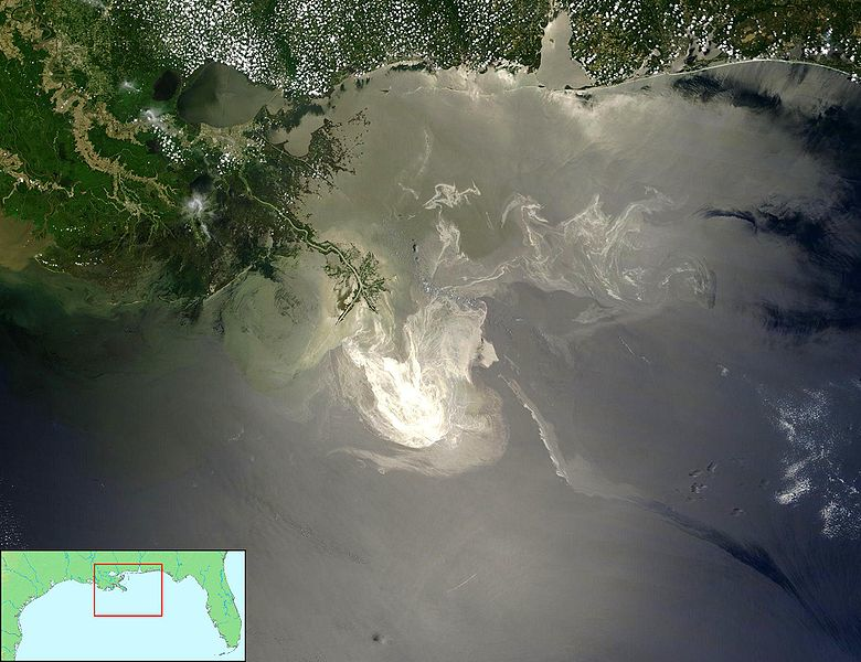
Deepwater Horizon Oil Spill

Datasets
NOAA Data:
- National Oceanic and Atmospheric Administration
- Temperature and Salinity Data in Gulf of Mexico
- Measured using Floats, Gliders and Boats
US Fisheries and Wildlife Data:
- Animal Sightings on the Gulf Coast
- Birds, Turtles and Mammals
- Status: Oil Covered or Not
Both data sets have geographic coordinates for ever observation
Loading NOAA Data
NOAA data is a .rdata file so we need to read it specially:
- Download the data from http://heike.github.io/rwrks/summerschool/data/noaa.rdata
- Run the
getwd()command to find your current working directory - Place noaa.rdata in the directory from step 2.
- Run the command below:
load("noaa.rdata")
Floats
Lets take a peek at the top of the floats NOAA data.
head(floats, n = 2)
##   callSign Date_Time JulianDay Time_QC Latitude Longitude Position_QC
## 1 Q4901043 7/12/2010   2455390       1   24.823   -87.964           1
## 2 Q4901043 7/12/2010   2455390       1   24.823   -87.964           1
##   Depth Depth_QC Temperature Temperature_QC Salinity Salinity_QC  Type
## 1     2        1       29.83              1    36.59           1 Float
## 2     4        1       29.65              1    36.58           1 Float
Floats Plot
qplot(Longitude, Latitude, colour = callSign, data = floats) +
    coord_map()
Gliders
qplot(Longitude, Latitude, colour = callSign, data = gliders) +
    coord_map()
Boats
qplot(Longitude, Latitude, colour = callSign, data = boats) +
    coord_map()
Layering
This data has the same context - a common time and common place
- Want to aggregate information from different sources onto a common plot
- Start with a common background the lat/long grid
- With
ggplot2we will superimpose data onto this grid in layers
Layers
To give you an idea…
ggplot() +
    geom_path(data = states, aes(x = long, y = lat, group = group)) +
    geom_point(data = floats, aes(x = Longitude, y = Latitude, colour = callSign)) +
    geom_point(aes(x, y), shape = "x", size = 5, data = rig) +
    geom_text(aes(x, y), label = "BP Oil Rig",
              size = 5, data = rig, hjust = -0.1) +
    xlim(c(-91, -80)) + ylim(c(22,32)) + coord_map()
More Layering
- Most maps (and many plots) have multiple layers of data. The layers may be from the same or different datasets.
- ggplot2 builds around this same idea. Very easy to add additional layers to the plot. To do this we need to understand a little more about the underlying theory…
What is a Plot?
- A default dataset
- A coordinate system
- layers of geometric objects (geoms)
- A set of aesthetic mappings (taking information from the data and converting into an attribute of the plot)
- A scale for each aesthetic
- A facetting specification (multiple plots based on subsetting the data)
Floats Decomposed
- Data: floats
- Mappings:
| aesthetic | mapping |
|---|---|
| x | Longitude |
| y | Latitude |
| color | CallSign |
- Scales:
| aesthetic | scale |
|---|---|
| x | continuous |
| y | continuous |
| color | discrete |
- Layers: Points
- Facetting: None
qplot() vs ggplot()
qplot() stands for "quickplot":
- Automatically chooses default settings to make life easier
- Less control over plot construction
ggplot() stands for "grammar of graphics plot"
- Constructs the plot using components listed in previous slides
qplot() and ggplot() for Floats
Two ways to construct the same plot for float locations:
qplot(Longitude, Latitude, colour = callSign, data = floats)
Or:
ggplot(data = floats,
       aes(x = Longitude, y = Latitude, colour = callSign)) +
  geom_point() +
  scale_x_continuous() +
  scale_y_continuous() +
  scale_colour_discrete()
We can shorten that a bit
We fortunately don't need to be so verbose - Even ggplot() will automatically pick default scales:
ggplot(data = floats,
       aes(x = Longitude, y = Latitude, colour = callSign)) +
  geom_point()
Your Turn
Find the ggplot() statement that creates this plot:
What is a Layer?
A layer added ggplot() can be a geom…
- The type of geometric object
- The statistic mapped to that object
- The data set from which to obtain the statistic
… or a position adjustment to the scales
- Changing the axes scale
- Changing the color gradient
Layer Examples
| Plot | Geom | Stat |
|---|---|---|
| Scatterplot | point | identity |
| Histogram | bar | bin count |
| Smoother | line + ribbon | smoother function |
| Binned Scatterplot | rectange + color | 2d bin count |
More geoms described at http://docs.ggplot2.org/current/
Piecing Things Together
Want to build a map using NOAA data
- Coordinate system (mapping Long-Lat to X-Y)
- Add layer of state outlines
- Add layer of points for float locations
- Add layers for Oil Rig marker and label
- Adjust the range of x and y scales
The Result
ggplot() +
    geom_path(data = states, aes(x = long, y = lat, group = group)) +
    geom_point(data = floats, aes(x = Longitude, y = Latitude, colour = callSign)) +
    geom_point(aes(x, y), shape = "x", size = 5, data = rig) +
    geom_text(aes(x, y), label = "BP Oil Rig", size = 5, data = rig, hjust = -0.1) +
    xlim(c(-91, -80)) +
    ylim(c(22, 32)) + coord_map()
Your Turn
- Read in the animal.csv data:
animal <- read.csv("http://heike.github.io/rwrks/02-r-graphics/data/animal.csv")
- Plot the location of animal sightings on a map of the region
- On this plot, try to color points by class of animal and/or status of animal
- Advanced: Could we indicate time somehow?
One more map …
Using the ggmap package, we can download satellite images using the Google Maps API for specified regions of the world
library(ggmap)
gmap <- get_map(location=c(rig$x, rig$y), zoom=6)
## Map from URL : http://maps.googleapis.com/maps/api/staticmap?center=28.736628,-88.365997&zoom=6&size=640x640&scale=2&maptype=terrain&language=en-EN&sensor=false
ggmap(gmap, extent = 'normal') +
  geom_point(aes(Longitude, Latitude), shape="+", size=5, colour="black", data=subset(animal, Condition=="Dead")) +
  ggtitle("Crosses indicate locations of dead bird sightings")