class: center, middle, inverse, title-slide # dplyr ### Haley Jeppson and Sam Tyner --- ## The pipe operator `%>%` `f(x) %>% g(y)` is equivalent to `g(f(x), y)` i.e. the output of one function is used as input to the next function. This function can be the identity Consequences: - `x %>% f(y)` is the same as `f(x, y)` - statements of the form `k(h(g(f(x, y), z), u), v, w)` become `x %>% f(y) %>% g(z) %>% h(u) %>% k(v, w)` - read `%>%` as "then do" --- ## dplyr verbs There are five primary `dplyr` *verbs*, representing distinct data analysis tasks: - **Filter**: Select specified rows of a data frame, produce subsets - **Arrange**: Reorder the rows of a data frame - **Select**: Select particular columns of a data frame - **Mutate**: Add new or change existing columns of the data frame (as functions of existing columns) - **Summarise**: Create collapsed summaries of a data frame - **Group By**: Introduce structure to a data frame --- ## Filter Read in the french fries data (in the folder 03-r-format/data). The data are from an experiment on the effect of using three different fryer oils had on the taste of the fries. ```r library(tidyverse) french_fries <- read_csv("frenchfries.csv") french_fries %>% filter(subject == 3, time == 1) %>% head(3) ``` ``` ## # A tibble: 3 x 9 ## time treatment subject rep potato buttery grassy rancid painty ## <int> <int> <int> <int> <dbl> <dbl> <dbl> <dbl> <dbl> ## 1 1 1 3 1 2.90 0. 0. 0. 5.50 ## 2 1 1 3 2 14.0 0. 0. 1.10 0. ## 3 1 2 3 1 13.9 0. 0. 3.90 0. ``` `filter` is similar to the base function `subset` --- ## Filter (cont.) Multiple conditions in `filter` are combined with a logical AND (i.e. all conditions must be fulfilled) e.g. `filter(subject ==3, time ==1)` Logical expressions can also be used e.g. `filter(subject == 3 & time == 1)` or `filter(subject == 3 | subject == 4)` --- class: inverse ## Your Turn (~3 minutes) 1. Use `filter` to get a subset of the `french_fries` data 2. `%>%` the subset into `ggplot` and create a plot hint: what is the default first argument of the `ggplot` function? --- ## One Solution ```r french_fries %>% filter(as.numeric(time)>5) %>% ggplot(aes(x=painty, y=rancid)) + geom_point(aes(color=subject)) + geom_smooth() + theme(legend.position = "none") ``` 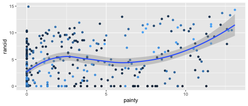<!-- --> --- ## Arrange ```r french_fries %>% arrange(desc(rancid), potato) %>% head(3) ``` ``` ## # A tibble: 3 x 9 ## time treatment subject rep potato buttery grassy rancid painty ## <int> <int> <int> <int> <dbl> <dbl> <dbl> <dbl> <dbl> ## 1 9 2 51 1 7.30 2.30 0. 14.9 0.100 ## 2 10 1 86 2 0.700 0. 0. 14.3 13.1 ## 3 5 2 63 1 4.40 0. 0. 13.8 0.600 ``` Successive variables are used for breaking ties from previous variables. ```r french_fries %>% arrange(rancid, potato) %>% head(3) ``` ``` ## # A tibble: 3 x 9 ## time treatment subject rep potato buttery grassy rancid painty ## <int> <int> <int> <int> <dbl> <dbl> <dbl> <dbl> <dbl> ## 1 9 3 78 2 0. 0. 0. 0. 0. ## 2 6 1 3 1 0.400 1.20 0. 0. 9.50 ## 3 7 1 78 2 0.500 1.00 0. 0. 2.00 ``` --- class: inverse ## Your Turn (~2 min) 1. Look up the help file for the function `slice`. 2. Use `slice` on the arranged `french_fries` data to select a single row 3. use `slice` to select multiple rows --- ## Solution ```r french_fries %>% arrange(desc(rancid), potato) %>% slice(10) ``` ``` ## # A tibble: 1 x 9 ## time treatment subject rep potato buttery grassy rancid painty ## <int> <int> <int> <int> <dbl> <dbl> <dbl> <dbl> <dbl> ## 1 6 3 19 2 6.10 3.60 0. 13. 6. ``` ```r french_fries %>% arrange(desc(rancid), potato) %>% slice(1:5) ``` ``` ## # A tibble: 5 x 9 ## time treatment subject rep potato buttery grassy rancid painty ## <int> <int> <int> <int> <dbl> <dbl> <dbl> <dbl> <dbl> ## 1 9 2 51 1 7.30 2.30 0. 14.9 0.100 ## 2 10 1 86 2 0.700 0. 0. 14.3 13.1 ## 3 5 2 63 1 4.40 0. 0. 13.8 0.600 ## 4 9 2 63 1 1.80 0. 0. 13.7 12.3 ## 5 5 2 19 2 5.50 4.70 0. 13.4 4.60 ``` --- ## Select ```r french_fries %>% select(time, treatment, subject, rep, potato) %>% head() ``` ``` ## # A tibble: 6 x 5 ## time treatment subject rep potato ## <int> <int> <int> <int> <dbl> ## 1 1 1 3 1 2.90 ## 2 1 1 3 2 14.0 ## 3 1 1 10 1 11.0 ## 4 1 1 10 2 9.90 ## 5 1 1 15 1 1.20 ## 6 1 1 15 2 8.80 ``` --- ## Summarise ```r french_fries %>% summarise(mean_rancid = mean(rancid, na.rm=TRUE), sd_rancid = sd(rancid, na.rm = TRUE)) ``` ``` ## # A tibble: 1 x 2 ## mean_rancid sd_rancid ## <dbl> <dbl> ## 1 3.85 3.78 ``` --- ## Summarise and Group_by ```r french_fries %>% group_by(time, treatment) %>% summarise(mean_rancid = mean(rancid), sd_rancid = sd(rancid)) ``` ``` ## # A tibble: 30 x 4 ## # Groups: time [?] ## time treatment mean_rancid sd_rancid ## <int> <int> <dbl> <dbl> ## 1 1 1 2.76 3.21 ## 2 1 2 1.72 2.71 ## 3 1 3 2.60 3.20 ## 4 2 1 3.90 4.37 ## 5 2 2 2.14 3.12 ## 6 2 3 2.50 3.38 ## 7 3 1 4.65 3.93 ## 8 3 2 2.90 3.77 ## 9 3 3 3.60 3.59 ## 10 4 1 2.08 2.39 ## # ... with 20 more rows ``` --- class: inverse ## Quick Your Turn (~2 minutes) 1. `%>%` the summaries into `ggplot` --- ## A Solution ```r french_fries %>% group_by(time, treatment) %>% summarise(mean_rancid = mean(rancid), sd_rancid = sd(rancid)) %>% ggplot(aes(x = mean_rancid)) + geom_histogram() ``` 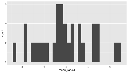<!-- --> --- ## Mutate Change an existing or create a new variable into the data ```r french_fries %>% mutate(awful = (buttery+potato)/2 - (grassy+painty+rancid)/3, time = as.numeric(time)) %>% glimpse() ``` ``` ## Observations: 696 ## Variables: 10 ## $ time <dbl> 1, 1, 1, 1, 1, 1, 1, 1, 1, 1, 1, 1, 1, 1, 1, 1, 1, 1... ## $ treatment <int> 1, 1, 1, 1, 1, 1, 1, 1, 1, 1, 1, 1, 1, 1, 1, 1, 1, 1... ## $ subject <int> 3, 3, 10, 10, 15, 15, 16, 16, 19, 19, 31, 31, 51, 51... ## $ rep <int> 1, 2, 1, 2, 1, 2, 1, 2, 1, 2, 1, 2, 1, 2, 1, 2, 1, 2... ## $ potato <dbl> 2.9, 14.0, 11.0, 9.9, 1.2, 8.8, 9.0, 8.2, 7.0, 13.0,... ## $ buttery <dbl> 0.0, 0.0, 6.4, 5.9, 0.1, 3.0, 2.6, 4.4, 3.2, 0.0, 0.... ## $ grassy <dbl> 0.0, 0.0, 0.0, 2.9, 0.0, 3.6, 0.4, 0.3, 0.0, 3.1, 0.... ## $ rancid <dbl> 0.0, 1.1, 0.0, 2.2, 1.1, 1.5, 0.1, 1.4, 4.9, 4.3, 2.... ## $ painty <dbl> 5.5, 0.0, 0.0, 0.0, 5.1, 2.3, 0.2, 4.0, 3.2, 10.3, 2... ## $ awful <dbl> -0.3833333, 6.6333333, 8.7000000, 6.2000000, -1.4166... ``` --- ## Caution: Trap! Why does ```r french_fries$awful ``` ``` ## Warning: Unknown or uninitialised column: 'awful'. ``` ``` ## NULL ``` not return a real-valued summary? -- - Because we never saved it back into the `french_fries` data - Go back and have a look --- ## `mutate` OR `summarize`? Both commands introduce new variables - so which one should we use? .pull-left[ `mutate` - **adds variables** to the existing data set - The resulting variables must have the **same length** as the original data - e.g. use for transformations, combinations of multiple variables ] .pull-right[ `summarize` - **creates aggregates** of the original data - The number of rows of the new dataset is determined by the number of combinations of the grouping structure. - The number of columns is determined by the number of grouping variables and the summary statistics. ] --- ## Shortcuts `summarize(n = n())` is equivalent to `tally()` ```r french_fries %>% tally() french_fries %>% summarize(n=n()) ``` `group_by(time, subject) %>% summarize(n = n())` is equivalent to `count(time, subject)` ```r french_fries %>% count(time, subject) french_fries %>% group_by(time, subject) %>% summarize(n=n()) ``` --- ## Are replicates similar? ```r reps <- french_fries %>% group_by(time, subject, treatment) %>% summarise(potato_diff = diff(potato), potato = mean(potato)) reps ``` ``` ## # A tibble: 348 x 5 ## # Groups: time, subject [?] ## time subject treatment potato_diff potato ## <int> <int> <int> <dbl> <dbl> ## 1 1 3 1 11.1 8.45 ## 2 1 3 2 -0.500 13.6 ## 3 1 3 3 -4.60 11.8 ## 4 1 10 1 -1.10 10.4 ## 5 1 10 2 1.70 10.2 ## 6 1 10 3 -1.20 10.7 ## 7 1 15 1 7.60 5.00 ## 8 1 15 2 -2.00 8.00 ## 9 1 15 3 2.20 6.90 ## 10 1 16 1 -0.800 8.60 ## # ... with 338 more rows ``` --- ## Are replicates similar? (contd.) ```r reps %>% ggplot(aes(x = potato, y = potato_diff, colour = as.numeric(time))) + facet_wrap(~subject) + geom_hline(aes(yintercept=0)) + geom_point() ``` 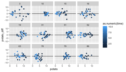<!-- --> --- class: inverse ## Your Turn (10 min) Try to answer (a part of) the question: **are different ratings similar**? Note: there are many different ways of answering this question. Consider ways to plot or summarize the data. --- ## One Solution ```r french_fries %>% ggplot(aes(x = potato, y = buttery)) + geom_point() + theme(aspect.ratio=1) + xlim(c(0,15)) + ylim(c(0,15)) + geom_abline(colour = "grey50") ``` 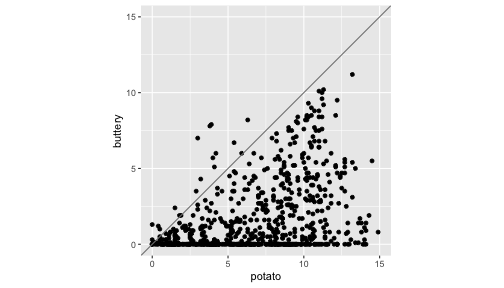<!-- --> --- ## Another Solution For a numeric approach, we could compute means across subjects for each week and compare those values: ```r ffm <- french_fries %>% group_by(time) %>% summarise(potato = mean(potato, na.rm=TRUE), buttery = mean(buttery, na.rm=TRUE), painty = mean(painty, na.rm=TRUE)) ffm ``` ``` ## # A tibble: 10 x 4 ## time potato buttery painty ## <int> <dbl> <dbl> <dbl> ## 1 1 8.56 2.24 1.65 ## 2 2 8.06 2.72 1.44 ## 3 3 7.80 2.10 1.31 ## 4 4 7.71 1.80 1.37 ## 5 5 7.33 1.64 2.02 ## 6 6 6.67 1.75 2.34 ## 7 7 6.17 1.37 2.68 ## 8 8 5.43 1.18 3.94 ## 9 9 5.67 1.59 3.87 ## 10 10 5.70 1.76 5.29 ``` --- ## Another Solution (cont) ```r ffm %>% ggplot(aes(x = time, y = potato)) + geom_point(colour = "blue", size=3) + geom_point(aes(y = buttery), colour = "forestgreen", size=3) + geom_point(aes(y = painty), colour = "red", size=3) + ylab("Score") ``` <!-- --> This doesn't seem like an elegant or efficient way of answering the question: the data is in an awkward form! --- ## Another option The package `GGally` has an implementation of a scatterplot matrix using ggplot2: ```r GGally::ggpairs(data = french_fries[ ,5:9]) ``` <!-- --> --- class: inverse ## Your Turn (10 min) The dataset `ChickWeight` is part of the core packages that come with R **Hint**: `data(ChickWeight)` gets the data into your active session. From the help file: > four groups of chicks on different protein diets. The body weights of the chicks were measured at birth and every second day thereafter until day 20. They were also measured on day 21.  --- class: inverse ## Your Turn (10 min) 1. Create a line plot with each line representing the weight of each Chick 2. Focus on weight on day 21. Draw side-by-side dotplots of weight by diet. 3. **Bonus**: Use `summarize` the average weight on day 21 under each diet. Overlay the dotplots by error bars around the average weight under each diet (see `?geom_errorbar`) **Hint** for 1: check out `?group` and consider what varible or variables you might map to this option --- ## Solution - Q1 ```r ChickWeight %>% ggplot(aes(x=Time, y=weight, group=Chick, color=Diet)) + geom_line() + facet_wrap(~Diet) ``` <!-- --> --- ## Solution - Q2 ```r ChickWeight %>% filter(Time==21) %>% ggplot(aes(x=Diet)) + geom_point(aes(y=weight, color=Diet), size=3) ``` <!-- --> --- ## Solution - Q3 First, we need a separate dataset for the summary statistics: ```r ChickW1 <- ChickWeight %>% filter(Time==21) %>% group_by(Diet) %>% summarize(mean_weight = mean(weight, na.rm=TRUE), sd_weight = sd(weight, na.rm=TRUE)/n()) ``` --- ## Solution - Q3 (cont) ```r ChickWeight %>% filter(Time==21) %>% ggplot(aes(x=Diet)) + geom_point(aes(y=weight), size=2) + geom_errorbar(data= ChickW1, aes(ymin = mean_weight-1.96*sd_weight, ymax = mean_weight+1.96*sd_weight, colour = Diet), width=.3) + geom_point(data=ChickW1, aes(y=mean_weight, color=Diet), size=3) ``` <!-- --> --- ## `Mutate` is incredibly flexible Consider a new variable `gain`, which gives the increase in weight of a chick since birth ```r ChickPlus <- ChickWeight %>% group_by(Chick) %>% mutate(gain = weight - weight[Time == 0]) ``` ``` ## Observations: 12 ## Variables: 3 ## $ weight <dbl> 42, 51, 59, 64, 76, 93, 106, 125, 149, 171, 199, 205 ## $ Time <dbl> 0, 2, 4, 6, 8, 10, 12, 14, 16, 18, 20, 21 ## $ gain <dbl> 0, 9, 17, 22, 34, 51, 64, 83, 107, 129, 157, 163 ``` --- ## Plotting weight gain ```r ChickPlus %>% ggplot(aes(x = Time, y = gain, group = Chick)) + geom_line(aes(color=Diet)) + facet_wrap(~Diet) ``` <!-- --> --- ## Re-cap - getting used to `dplyr` actions can take a bit of time and practice - recognize keywords and match them to `dplyr` functions - incorporate `dplyr` functions in your regular workflow - the long-term benefits are there, promise!